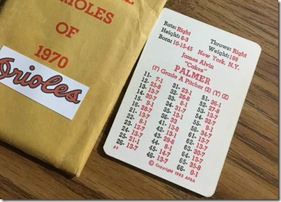
Doug Schuyler showed me this 1970 Jim Palmer and I was all like “Huh? I don’t get it.” Then it hit me.
If you’re lucky enough to hit “Cakes”’ second column, what happens when you roll a 36? There simply isn’t a number there. Palmer has a 36-33 and that’s it.
This is a favorite card format by a lot of APBA fans (error notwithstanding). I wonder how graphic designers feel about it. The fonts don’t line up correctly and I admit that bugs me a little. I still like the format; it has a lot of sentimental value. Maybe more if all of the numbers are included.
thanks, Doug!


I never liked the GTOP font. As you say, the columns are often askew, plus the numbers just look so crammed together and small. Phooey.
I love the font. Probably because it’s the 60s card font I grew up with.
I don’t see how the choice of font causes alignment issues – can someone explain what they mean by that?
Hi Steve,
I personally liked the format from when I grew up in the 70’s with what appears to be in an Arial bold font. While I don’t know “how they work” completely is that if you take this font, whatever it may be, and switch it to say Arial the size of the lettering changes by a fraction of a size in sometime both height and width, and even switching to bold alters it further, so if you are using a template it causes alignment issues, especially with tabs involved.
I am hoping someone smarter than me can either verify or correct this.
The next font switch appears to be around my return to the game in the 90’s which is a Times New Roman font, which I liked, but again causes slight alignment issues compared to the other versions.
Guessing the missing number is a 7.
Steve, I suppose they are separate issues, but misalignments seem particular to certain sets including this one, and the first 1969 reprint among others.
I personally don’t see anything wrong with this card.
No second column number at 33, Wayne.
Oh yeah now I see.
Love it!