A look at the newly redesigned diamond for APBA Baseball…
APBA has announced via their latest newsletter that they are rebuilding the APBA Baseball and APBA Football games.
Via the newsletter, here are the pertinent details:
“We are rebuilding these games. There are no changes to the boards, except the game boards will be larger. Each board will be 11 x 14 instead of 11 x 8.5. You will be able to make tabs on the edge of the game charts. The charts will be white with black ink–similar to the baseball master game. The game fields will be 10 x 15. Here are links to the new baseball and football fields. The packaging is a two piece box much stronger than the old packaging.”
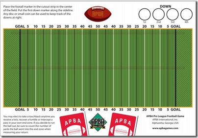
…and the APBA Football gridiron
The Football game will be re-organized by field position instead of type of play citing fan demand. Teams included in the 2013 game will include the 2012 Rams and 49ers and two unnamed teams. Future sets will always include the Super bowl teams.
Similar to the Football game, the Baseball game will always include the World Series teams. This year, the game will include the 2012 Angels and Nationals as well as the Giants and Tigers. The game will also include a Home Run Derby chat for those who want to try that out.
The box will be redesigned as well. Once that’s done, the APBA Game Company will make a final release announcement. APBA has set a target date for both games for April 1.


I’d say the overall look of the new fields is an improvement over the last versions. However, there are a few things I don’t like, and it’s mostly about the baseball field.
I’m sure the illustration is not intended to be super-realistic but the perspective on the baseball field is wrong – the pitcher’s mound looks to be too close to home plate.
Considering that some competitor’s use actual ballpark photos on their game’s playing fields, the cartoon-like illustrations of a bat and ball kind of make the APBA baseball field look like it’s part of a children’s game. It makes it appear a little like an “APBA Andy” type of game component. Also, the baseball looks more like a huge beach ball that’s floating above the field/stands.
And, since the football field has the “DOWN” circles labeled (1st, 2nd, 3rd and 4th), shouldn’t the baseball field have the “OUT” circles labeled as well (0,1,2)?
The football playing field looks pretty good as is. The only thing I might do is eliminate the illustration of the “APBA football” and position the APBA logo (which is currently at the bottom) in it’s place. The reason why I’d eliminate the “APBA football” illustration is the “APBA” name already appears twice (on the logo and on the player card backs), so having yet another element that incorporates the “APBA” name is redundant. Also, because the football illustration is done in a rather cartoonish style, it looks (but to a lesser extent than the baseball game’s bat and ball) that the component may be part of a youngster’s game as well.
Other than those things the new fields look pretty nice.
Lon