I may not have a voice for radio like TWIA’s John Asalon but I still got a little information to disseminate. This episode of “Keeping my APBA Stats with Excel” goes out to Brent Cline. He’s been asking about PivotTables and quite honestly, they are pretty cool.
In short, PivotTables allow you to draw relevant data from an Excel table and display it in a meaningful fashion. They are perfect to use to dynamically update stat leaderboards. Assuming you already have a league registry like I demonstrated in this episode, PivotTables can be very versatile.
They can also be a pain in the neck to set up sometimes. PivotTables with simple stats are not too difficult. However, for averages when you want to filter out players who don’t have the required amount of plate appearances to qualify, it is definitely a multi-step process.
[make sure to watch at full screen]
I also want to emphasize to everyone to keep your Excel tables defined and separate from others. It’s important to make sure all rows and columns are adjacent. In addition, make no unrelated data borders your table. If you follow these rules, you’re golden.
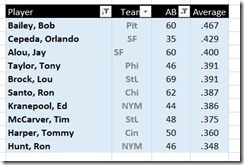
I only inserted a few PivotTables in the above demo. To get an idea of what my current setup looks like, this is what my Hitters Leaderboard looks like for my 1966 NL season.
Finally, for those who want to follow along, here are the files I’ve been working with for my demo.
thanks, Brent!


